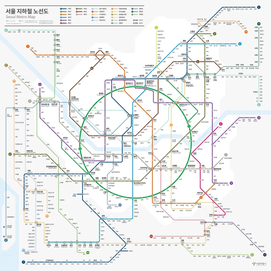
After four decades, Seoul subway map is finally getting a makeover. Since its creation in the 1980s, the map has remained largely unchanged, with new lines and stations continually added over time. However, this incremental expansion has led to increased complexity and reduced user-friendliness.

Seoul’s subway system is steadily expanding, linking with neighboring administrative regions like Incheon Metropolitan City, Gyeonggi Province, Chungcheongnam Province, and Gangwon Province. Despite differing fare systems and management entities across lines and specific areas, users tend to perceive it as a unified system without much distinction. Hence, it’s more apt to regard it as a metropolitan subway network rather than solely the Seoul subway system.
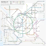
The new subway map stands out for its efforts to closely align with actual geographic features on the ground.

Upon comparing the old subway map with the revised version, notable differences become apparent. A closer scrutiny reveals that the updated map diverges significantly from the actual subway routes depicted on real maps.

The updated subway map has yielded significant improvements in navigation time for both domestic and international travelers, specifically those in the 20-30 age group. Through eye-tracking experiments, it was observed that the time required to locate stations decreased by up to approximately 55%, while the time needed to find transfer routes decreased by about 69%. Notably, the reduction in navigation time for foreigners was approximately 21.5% higher than that for locals, indicating the enhanced map’s potential to greatly assist first-time visitors exploring Seoul.
Additionally, the development of two different aspect ratios, 1:1 and 16:9, tailored for various digital platforms, aims to further enhance usability.
The features of the updated Seoul subway map
Implementing the international standard octolinear design, Line 2 is depicted in a circular shape.
The revamped Seoul subway map introduces the international standard octolinear design, with Line 2 adopting a circular layout to enhance readability and streamline navigation for commuters.
The “Octoliner” concept, originating from Henry Beck’s pioneering work on the London Underground in 1933, restricts line angles to horizontal, vertical, and 45-degree diagonals, establishing it as a widely accepted standard for schematic maps, ensuring user-friendly comprehension.
Furthermore, transfer stations are indicated using signal-style markers, contributing to improved clarity and ease of use for travelers.
The transfer stations are marked using a traffic light-style system.

Transfer stations, previously indicated by the same Taeguk symbol as regular stations, have been upgraded with a traffic light-style signage system. This system lists the colors of connecting lines for easy navigation towards the desired destination and is presented in a linked ring format.
Geographic Information Improved Spatial Comprehension

Seoul Metropolitan Government has made it easier for tourists to orient themselves by delineating the boundaries between downtown Seoul and its outskirts on the subway map, allowing them to understand their current location in relation to cardinal directions. Moreover, prominent geographic features like Incheon Airport, the sea, and the Han River are clearly marked on the map. Looking ahead, there are plans to introduce landmark icons onto the subway map next year to showcase Seoul’s notable attractions.
Enhanced color schemes and patterns have been implemented to improve the distinction between subway lines.

In addition, to enhance accessibility for color-blind individuals, those with visual impairments, and elderly passengers, the colors and patterns of the subway lines have been revamped. The intricate linear arrangement of the subway map has been reorganized based on routes and significance, categorizing the lines (mainline, suburban rail, urban rail, regional rail) by color and type. The mainline subways (Lines 1-9) serve as the centerpiece, with adjustments in brightness, clarity, and patterns to finely tune the depiction of each line.
The signage system has been enhanced to better cater to foreigners.

The updated subway map now features both station numbers and the corresponding subway lines alongside the station names, facilitating easier navigation.
Bungeoppang is one of the most popular winter street foods in Korea.